Kitchen Colour Combinations That Are Trending in 2026
I chose deep burgundy for my first kitchen renovation. Was absolutely certain about it. By month four I was tired of it. By year two I was avoiding looking at it while I cooked. Colour is the decision that feels the most personal and causes the most regret — so before you pick anything from this list of what's genuinely trending in 2026, there's one thing you need to know first.
Kitchen Colour Combinations That Are Trending in 2026
Colour is the decision that feels the most personal and causes the most regret.
I say this from experience. My first kitchen renovation I chose a deep burgundy for the lower shutters. I was absolutely certain about it. The designer showed me the sample, I said yes immediately, and for about three weeks after installation I was convinced it was the best decision I'd ever made.
By month four I was tired of it. By month eight I was explaining to every visitor that "it looked different in the sample." By year two I was actively avoiding looking at it while I cooked.
Colour is tricky because you see it every single day. It's the first thing you register when you walk into the kitchen in the morning and the last thing you see when you're cleaning up at night. A colour that feels exciting in a showroom or on a phone screen can feel exhausting at 7am when you haven't had chai yet.
So before I get into what's trending in 2026 - a caveat. Trends are useful as a starting point, not as instructions. What works in a north-facing Bengaluru flat with limited natural light is completely different from what works in a sunny Jaipur kitchen with two windows. Use this as inspiration, then adapt it to your actual space.
With that said - here's what's genuinely showing up in Indian kitchens right now, and more importantly, why it's working.
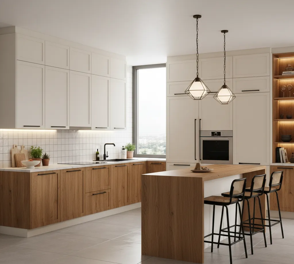
1. Warm Whites and Creamy Off-Whites
White kitchens never really left. But the cold, stark, almost clinical white that dominated the 2010s - that's going.
What's replacing it is warmer. Cream. Ivory. The kind of white that has a little yellow or beige in it. It reads as white when you're not looking closely but feels softer and more liveable than a pure bright white.
The reason this works especially well in Indian homes is light. Most Indian flats don't have the kind of abundant natural light that makes cold white look intentional rather than sterile. Warm whites pick up whatever light is available and make it feel like more. In kitchens with a single window or overhead lighting only, this matters enormously.
Pair warm white shutters with a natural stone countertop - beige granite, light Kota stone, or even a sand-coloured quartz - and the whole kitchen feels cohesive without requiring much effort. Add warm-toned brass or gold hardware and it becomes genuinely beautiful without being loud.
This combination is also one of the safest long-term choices you can make. You won't be tired of warm white in three years the way you might be tired of a trendy sage green or dusty rose.
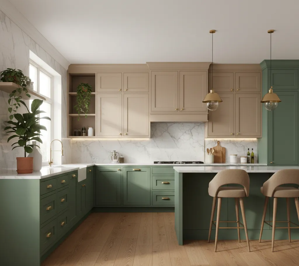
2. Olive Green and Natural Wood
This one surprised me when I first started seeing it in kitchen after kitchen. Olive green - not bright, not too muted, that specific warm green that sits somewhere between army green and sage - combined with natural wood tones.
The wood usually shows up on the upper cabinets or as open shelves, while the olive green anchors the lower cabinets. Or the opposite - wood lowers, olive green uppers. Either way the combination works because both colours pull from the same warm, earthy palette and don't fight each other.
What makes this combination work for Indian kitchens specifically is that both these tones age gracefully. A small oil splash on a dark olive shutter is far less visible than on a light grey or white one. The wood tone, whether real veneer or a wood-finish laminate, hides daily wear better than most solid colours.
The caveat - this combination needs decent lighting to not feel dark. In a kitchen with limited natural light and no under-cabinet LEDs, olive green and dark wood can make the space feel heavy. Get the lighting right first, then commit to the colour.
3. Two-Tone Kitchens - Different Colours for Upper and Lower Cabinets
This is the trend that's moved from "interesting idea" to mainstream in 2025 and 2026 and I think it's going to stay for a while because it solves a real problem.
The problem: you want colour but you're scared of committing the entire kitchen to it. Completely understandable.
The solution: put the bold or darker colour on the lower cabinets and keep the upper cabinets light - white, off-white, or light grey. The lower cabinets are visually anchored by the counter anyway, so a darker or more saturated colour there feels grounded rather than overwhelming. The light uppers keep the kitchen feeling open and airy.
Popular lower cabinet colours in 2026: deep navy, forest green, charcoal grey, terracotta, dusty blue. All paired with white or off-white uppers.
The practical advantage for Indian kitchens - the lower cabinets take the most beating. Kicks, splashes, daily physical contact. A darker colour on the lowers hides this wear. The upper cabinets, which mostly just open and close, can afford to be lighter because they're not getting knocked around the same way.
One thing to get right - the countertop needs to work with both colours. It's the connector. A mid-tone countertop, something in grey, beige, or a salt-and-pepper granite, will usually bridge the two cabinet colours cleanly.
4. Terracotta and Warm Earthy Tones
There's a return happening to colours that feel rooted in Indian material culture - and terracotta is at the centre of it.
Not the orange-red of a clay pot necessarily. More of a muted, dusty terracotta that reads as warm and sophisticated rather than loud. Think of the colour of old Rajasthani walls after a few monsoons - faded, warm, comfortable.
This colour works beautifully on one accent wall in the kitchen - specifically the backsplash wall behind the hob. Paired with white or cream cabinets, a terracotta backsplash tile or painted surface brings warmth without committing the entire kitchen to a bold colour.
Terracotta also pairs well with black hardware - matte black handles, black tap fittings, black light fixtures - in a way that feels current without being cold. The warmth of the terracotta balances what might otherwise be a harsh combination.
For kitchens in older homes or buildings with a traditional character - the kind of flat where the architecture itself has some heritage - terracotta feels genuinely appropriate. It doesn't fight the building, it works with it.
5. Charcoal and White - The Combination That Refuses to Age
Every few years someone declares black kitchens over and every year black kitchens continue to appear in the most well-designed homes.
In 2026 the version of this that's showing up most often isn't full black - it's charcoal. A deep, slightly warm dark grey that's almost black but not quite. It reads as sophisticated without the starkness of true black.
The charcoal-and-white combination works by contrast. Dark lower cabinets, white uppers. Or charcoal island (if you have one), white perimeter cabinets. Or charcoal on all cabinets with a white or light stone countertop to break it.
The reason this keeps working is simple - it's high contrast without being aggressive. The eye reads it as intentional. It photographs well which matters if you ever plan to sell the flat. And it ages well because it doesn't feel like a moment in time the way more fashion-forward colours can.
The practical concern for Indian homes: dark cabinets show dust. Not grease - dark surfaces actually hide grease marks better than light ones. But the fine dust that settles on horizontal surfaces in Indian cities, especially in drier climates, shows on dark cabinets more than light ones. Plan for wiping down cabinets more regularly than you might with a lighter colour.
6. Sage Green - Still Going Strong
Sage green became popular around 2022 and there was a moment where it started to feel overdone. Every second modular kitchen showroom had a sage display. Every Instagram kitchen renovation was sage.
In 2026, sage has done something interesting - it's settled. The oversaturation of the trend has passed and what's left is the version of the colour that actually works in homes: the quieter, more muted, slightly grey-green sage rather than the bright, almost minty version that was everywhere two years ago.
In an Indian kitchen, sage green works best in kitchens with good natural light. The colour needs light to come alive - in a dark kitchen it can look dull and slightly unwell, like a plant that isn't getting enough sun.
Pair it with warm wood tones and brushed brass hardware for a combination that feels calm and considered. Avoid pairing with cold chrome hardware - it makes the sage look flat. Warmth on warmth is the principle here.
If you're renovating a kitchen in a flat that gets good morning or afternoon light, sage is still a strong choice. Just choose the grey-sage rather than the green-sage and you'll be fine five years from now.
7. Dusty Blue and White - Underrated and Underused
This one doesn't show up in enough Indian kitchens and I think it should.
Dusty blue - sometimes called powder blue or muted blue, the kind of blue that has a grey undertone - combined with white creates a kitchen that feels clean, calm, and just slightly unexpected. It's not the navy that's becoming common. It's lighter, more airy, more appropriate for smaller kitchens where a deep colour would feel heavy.
The reason this works well in Indian homes - blue is a colour that reads as cool, which is psychologically useful in a hot climate. Standing in a kitchen that feels visually cool while actually cooking is a small comfort, but it's real.
Dusty blue lower cabinets with white uppers, white subway tile backsplash, and brushed nickel or chrome hardware - this combination feels timeless in a way that some of the earthier trends don't. It's also less common in Indian kitchens right now, which means if you do it, your kitchen looks considered rather than copied from the nearest showroom.
8. All-Matte Everything
This is less about colour and more about finish - but it deserves its own section because it's changing how kitchens look more than any specific colour trend.
Matte finishes on shutters, matte hardware, matte countertops - the kitchen that reflects nothing and absorbs light instead of bouncing it. The effect is quiet and sophisticated in a way that high-gloss kitchens never quite managed.
The practical case for matte in Indian kitchens is strong. Oil mist from daily cooking settles on every surface. On a gloss shutter, this shows as streaks and fingerprints and needs wiping constantly. On a matte surface, the same mist is far less visible. Matte surfaces still need cleaning - they're just more forgiving about when.
The combination that's showing up most in 2026: matte warm white or matte sage shutters, a slightly textured or leathered stone countertop, matte black hardware. It looks expensive. It's not necessarily more expensive than the gloss equivalent. It just reads as more considered.
The one caution - matte surfaces can be harder to clean when something does stain. A turmeric splash on a matte white surface needs immediate attention in a way it might not on a gloss surface. Keep a damp cloth easily accessible when cooking, not buried in a drawer somewhere.
9. Natural Materials as Colour - Stone, Wood, Concrete
The most interesting shift in 2026 kitchen design ↗ isn't really about colour at all - it's about material.
More and more kitchens are letting natural materials do the visual work. A live-edge wooden shelf. A raw concrete countertop section. A stone backsplash with the natural veining visible. A terracotta tile floor.
These materials bring colour in a way that no paint or laminate can replicate because the colour is irregular, imperfect, and specific. No two pieces of natural stone look the same. The variation is the point.
For Indian homes this is both a trend and a return - stone countertops, clay tiles, wooden shelves, these are not new ideas in Indian domestic architecture. What's new is treating them as design choices rather than practical defaults.
If you're renovating a kitchen in 2026 and you want it to feel genuinely current, consider where a natural material could replace a manufactured one. A slab of granite as a backsplash instead of ceramic tile. A solid wood shelf instead of a laminate-finished one. These choices date better than any colour trend because nature doesn't go out of style.
10. The Combination Nobody Talks About - Off-White and Black
Simple. Honest. Works in every lighting condition, every kitchen size, every home style.
Off-white cabinets - not pure white, that warmer ivory or cream - with matte black hardware and a black or dark grey countertop. That's the combination. It sounds like it shouldn't work as well as it does.
The reason it works: the off-white is warm enough to feel liveable, the black hardware and countertop are grounding, and the contrast between them is strong enough to make the kitchen feel intentional without being dramatic. It's the kitchen equivalent of a well-cut white shirt with dark trousers. Classic, always appropriate, never trying too hard.
In Indian kitchens specifically - off-white with black hardware photographs beautifully, hides turmeric splashes better than pure white, and doesn't require any particular style of home to feel appropriate. Whether your flat is a new construction with clean lines or an older building with character, this combination fits.
It's also the easiest combination to add to over time. A plant. A coloured ceramic dish on an open shelf. A bright hand towel. These small additions of colour pop against the off-white and black in a way they wouldn't against a coloured cabinet background.
Before You Choose Anything - The Questions That Actually Matter
How much natural light does the kitchen get, and from which direction? North-facing kitchens need warm colours. South and west-facing kitchens can handle cooler or darker colours without feeling gloomy.
How big is the kitchen? Dark colours in small kitchens need excellent lighting to not feel oppressive. If you're set on a dark colour in a small kitchen, plan the under-cabinet lighting before anything else.
How much cooking happens - and what kind? Heavy daily Indian cooking means oil mist, steam, turmeric, and constant physical contact with surfaces. Matte finishes, mid to dark tones, and easy-to-wipe countertops matter more than they do in a kitchen that sees light use.
How long are you planning to stay in this flat? If you're renovating to sell in two to three years, neutral colours - warm white, greige, light grey - are safer because they appeal to more buyers. If this is your home for the next decade, choose what you actually love.
One Last Thought
Colour is personal. More personal than layout, more personal than material choice, more personal than hardware brand. No trend is right for every kitchen or every family.
The combinations in this list are trending because they're working for a lot of people right now - but the kitchen that works for you is the one designed around your light, your cooking, your daily life in that space.
Look at these combinations, find the one that makes you pause and look twice, then ask yourself whether it suits your kitchen's light and your own tolerance for maintenance. That question will take you further than any trend list can.
