Two-Tone Kitchen Cabinet Design Ideas
My bhabhi's navy-and-white kitchen hides every oil splatter. My friend's grey-and-yellow kitchen highlights every dust speck. Two-tone is brilliant when it works and painful when it doesn't. Here's what I've learned from watching both.
Two-Tone Kitchen Cabinet Design Ideas
My bhabhi's kitchen has dark navy base cabinets and white upper cabinets. My parents' kitchen is light grey everywhere - top to bottom, same shade, same finish. When bhabhi visits, she looks at mummy's kitchen and says, politely, "It's very... uniform." When mummy visits bhabhi, she looks at the two-tone cabinets and says, also politely, "It's very... busy."
They're both wrong. They're both right. And the fact that two intelligent women can look at each other's kitchens and have completely opposite reactions tells you everything about why two-tone cabinet design is simultaneously the best and most divisive trend in Indian kitchens right now.
I've watched four kitchens in my family and friend circle go two-tone in the last three years. Some look incredible. One was a mistake the homeowner won't admit. And every single one taught me something about how colour pairing works in real Indian cooking conditions - not on a mood board, not in a showroom, but in a kitchen where haldi exists and oil splatters travel.
Bhabhi's Navy and White (The One That Made Everyone Jealous)
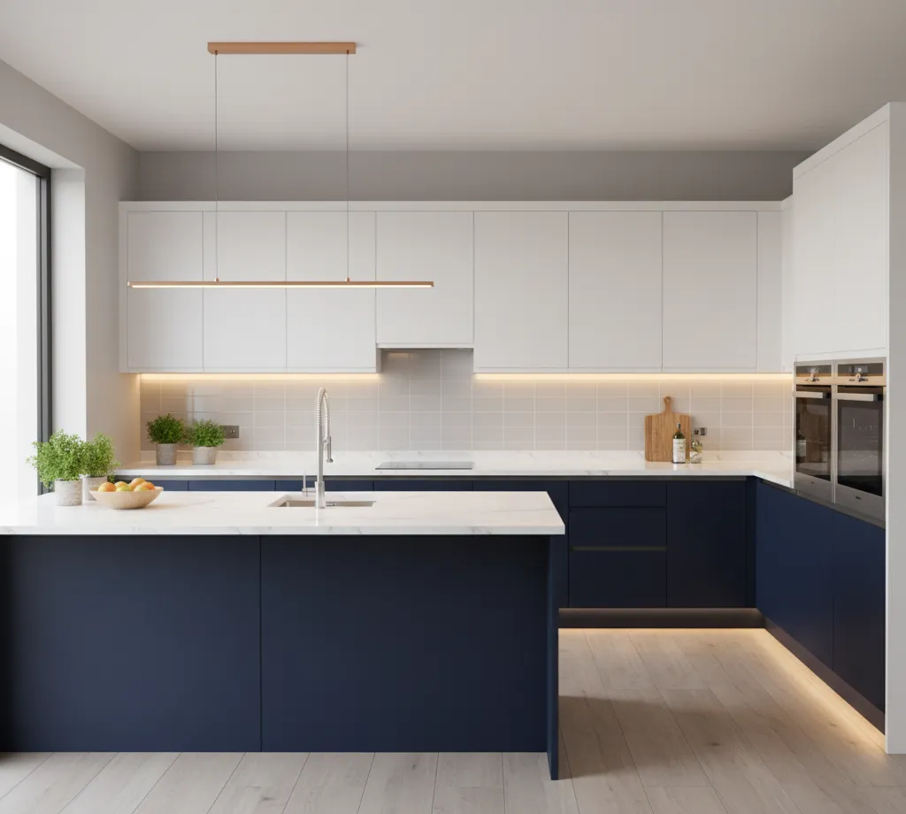
When bhabhi was picking colours for her Jagatpura kitchen, she did something unusual - she went to the showroom with a photo of her living room. "I want the kitchen to feel like the same house," she told the designer. Her living room has grey walls, a navy blue sofa, and white curtains. So the kitchen got navy base cabinets and white uppers.
The effect was immediate. When you walk from her living room into the kitchen, there's no colour shock. The navy carries through. The white connects to the curtains and ceiling. It feels like one designer planned the whole apartment, which technically they didn't - her living room was done by a different person entirely. The two-tone just happened to bridge both spaces.
But here's the practical bit that matters in a Jaipur kitchen. The navy base cabinets - which are at hip and knee height, where oil splatters land, where hands touch, where kids' dirty fingers make contact - hide EVERYTHING. Grease spots, water marks, fingerprints, that mysterious brown smudge near the stove that nobody can explain. All invisible on dark navy. Bhabhi wipes her base cabinets maybe once a week. Maybe.
The white upper cabinets - which sit above counter height, away from cooking splatter, mostly just holding dry items - stay remarkably clean because nothing greasy reaches them. She wipes those every two weeks or so. No yellowing. No staining. Because the upper zone of a kitchen doesn't take the same abuse as the lower zone.
This is the fundamental logic of two-tone that most design articles skip. It's not just about aesthetics. Dark below, light above is a FUNCTIONAL choice for Indian kitchens. The part of the kitchen that gets dirty is dark. The part that stays clean is light. You get the visual drama of two colours AND a maintenance system built into the colour scheme.
Cost difference over single-tone? Almost nothing. The laminate sheets come in different colours but cost the same. Bhabhi paid zero premium for two-tone versus what she'd have paid for all-navy or all-white. The showroom just used two different laminate codes instead of one.
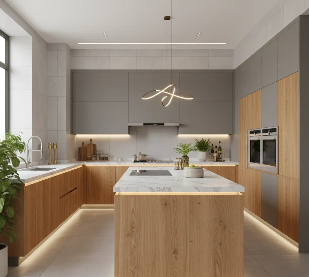
My Cousin Rohit's Walnut and Cream (The Warm Option)
Rohit - the one whose particle board kitchen I've written about before - rebuilt his kitchen after the swelling disaster. This time he went with better materials and, surprisingly, put thought into the colour scheme.
His wife Megha wanted something "warm but modern." She'd been scrolling through kitchen photos for weeks and kept coming back to wood-toned kitchens. But full wood-tone on every cabinet felt too heavy for their 8-by-9-foot kitchen. The designer suggested walnut finish on the base cabinets and cream on the uppers.
The result feels like a completely different kitchen from the all-white one he had before. The walnut - a rich, reddish brown laminate with visible grain texture - gives the base cabinets a substantial, grounded feel. The cream uppers keep the top half of the kitchen light and airy. Together, the kitchen feels bigger than it is because the light upper section draws your eye up and the darker base anchors it down.
Megha's favourite part - and I'd never have thought of this - is that the walnut grain texture HIDES scratches and minor surface damage in a way that a plain solid colour can't. On a solid navy or solid grey cabinet, a scratch is a white line against a uniform background. On walnut-textured laminate, a scratch blends into the grain pattern. You'd have to look very closely to spot it. After two kids and one year of daily cooking, Rohit's walnut base cabinets have taken plenty of abuse. You genuinely can't tell.
The cream uppers have one issue. Cream is not white. It's warmer, yellowish. In certain lighting - specifically the warm-toned LED strip she has under the upper cabinets - the cream can look slightly dirty compared to the cooler white walls. Megha solved this by changing her LED strip from warm white to neutral white. ₹400 for a replacement LED roll. The cream now looks like cream, not like white-that's-gotten-old.
The Combination That Didn't Work (My Friend Ankit's Kitchen)
I need to tell you about this one because not every two-tone decision ends well, and no blog will be honest about failures.
Ankit's kitchen in Vaishali Nagar went dark grey base cabinets with bright yellow uppers. He'd seen it on Instagram. An Italian kitchen. Glossy. Dramatic. High contrast. It looked stunning on the screen.
In a 9-by-10-foot Indian kitchen with warm-toned granite counters and beige floor tiles? It looks like someone assembled the kitchen from two different kitchens. The grey and yellow don't fight exactly, but they don't talk to each other either. They just... exist side by side with an uncomfortable tension.
The bigger problem: the bright yellow uppers HIGHLIGHT every speck of dust. And in Jaipur between March and June, dust is not a speck. It's a film. Yellow - especially glossy yellow - shows dust the way a dark car shows rain spots. Ankit's wife wipes the upper cabinets almost daily during summer. During monsoon and winter, the yellow also picks up a faint grease film from cooking steam that rises and settles on the upper cabinet faces. The film isn't visible on the grey lowers. It's glaringly visible on bright yellow.
Ankit won't admit the yellow was a mistake. His wife has said it privately to three people, one of whom told me. He's now planning to add a full-length backsplash tile to "change the look" - which I suspect is code for distracting attention from the yellow cabinets he can't replace without spending another ₹30,000.
Lesson: two-tone works when the colours complement each other AND your kitchen's existing finishes - countertop, floor, backsplash, wall paint. Ankit picked two colours that looked good in isolation but clashed with the warm beige everything-else in his kitchen. Test your colour combination against the ACTUAL countertop and floor you have. Not against a white showroom display wall.
The Trending Combinations I'm Seeing in Jaipur Right Now
After visiting kitchens, stalking Instagram feeds of local designers, and spending unhealthy amounts of time at the Ajmer Road showrooms, here's what's actually showing up in Jaipur apartments in 2026.
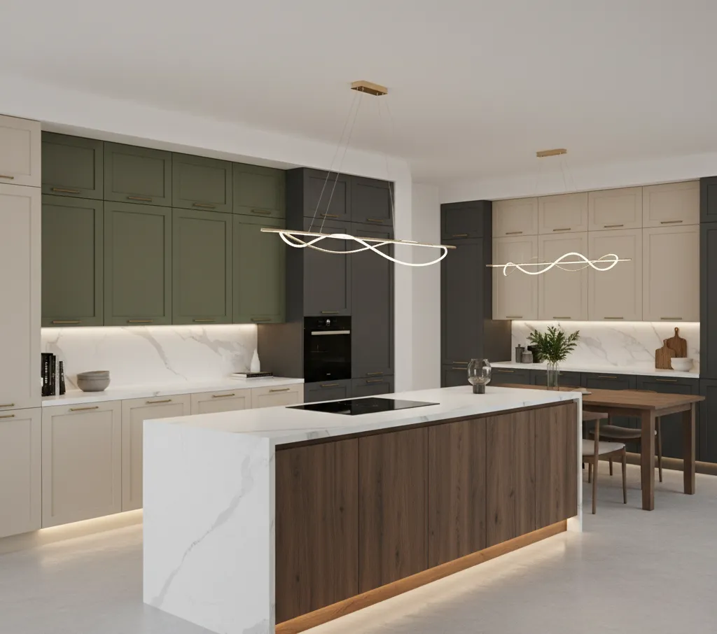
Forest green base with white or cream uppers. This is EVERYWHERE right now. The green ranges from deep emerald to softer sage depending on the homeowner's courage level. It reads as modern, warm, and distinctly not-boring. Paired with brass handles - which Jaipur families gravitate toward naturally because of the Rajasthani aesthetic - it looks genuinely stunning. And dark green on the base hides haldi stains almost as well as black does.
Dusty rose or muted pink base with light grey uppers. I've seen this in two new kitchens in the last six months. It sounds risky. It's not. The dusty rose is so muted and grey-toned that it reads more like "warm neutral" than "pink." The effect is soft, modern, and noticeably different from the navy-and-white combinations everyone else has. Not for everyone. But for the right personality, it's a statement.
Charcoal base with warm wood-toned uppers. The reverse of Rohit's combination. Dark charcoal below, light oak or ash-toned wood laminate above. The wood adds warmth that pure white wouldn't. The charcoal adds seriousness that lighter colours wouldn't. It's the combination I'd personally pick if I were building a kitchen tomorrow, but I've been told I have "aggressively neutral taste" so take that with some salt.
The Rules I've Picked Up From Watching Real Kitchens
Nobody told me these. I collected them from watching colour choices succeed and fail across multiple homes. They're not absolute rules - more like patterns I've noticed.
Dark colours on the bottom, light colours on top. Almost always works. The reverse - light base, dark uppers - makes kitchens feel top-heavy and smaller. The kitchen in our family where the uncle tried dark uppers with light base felt oppressive until he added under-cabinet LED strips, which helped but didn't fully fix the visual weight issue.
Match your two-tone to the warmth of your counter and floor. Warm countertops - beige granite, warm grey quartz, wood - pair best with warm cabinet tones. Walnut and cream. Navy and ivory. Green and warm white. If your granite is cool-toned - black with silver flecks, blue-grey - then cooler cabinet colours work better. Grey and white. Charcoal and pale blue. Mixing warm cabinets with a cool counter creates a subtle visual discomfort that most people can't name but definitely feel.
Keep the hardware consistent. Bhabhi uses brass handles on both navy and white cabinets. Same handle. Same finish. The hardware ties the two colours together. Ankit used chrome handles on the grey cabinets and a different chrome style on the yellow ones. Two different handle styles made the mismatched feeling worse.
One more thing - the countertop colour acts as the bridge between your two cabinet tones. It should relate to BOTH colours, not just one. A warm grey quartz connects navy bases and white uppers because grey has elements of both. A stark white counter would make the navy bases feel disconnected. A very dark counter would make the white uppers feel disconnected. The counter is the mediator. Choose it carefully.
How Much Two-Tone Costs vs Single Tone
Almost nothing extra. This is the part that surprises everyone.
Laminate comes in hundreds of colours. A navy laminate sheet costs the same as a grey one. A walnut-finish sheet costs the same as a plain white one. The factory cuts the cabinets the same way regardless of colour. Installation is identical. Hardware is identical.
The only potential cost difference: if you choose two different TYPES of finish - say, matte laminate for the base and glossy acrylic for the uppers - then the price difference is between those finish types, not between the colours. Bhabhi's navy matte and white matte cost her zero extra. If she'd gone navy matte and white glossy acrylic, the acrylic uppers would've added ₹15,000-20,000 because acrylic is pricier than laminate.
Stick with the same finish type in two different colours and two-tone costs you nothing. Literally nothing. Just tell the showroom you want two laminate codes instead of one. They won't even blink.
There's no reason NOT to go two-tone if the idea appeals to you. The cost barrier doesn't exist. The only barrier is choosing the right combination - and after watching four kitchens get it right and one get it memorably wrong, I'd say: start with dark base and light top, match the warmth to your countertop, and for the love of everything, test your chosen colours against your actual floor and granite before signing the quotation.
Ankit didn't test. Don't be Ankit.
More kitchen colour advice from someone who's inspected way too many cabinets? KitchenKaki - where we judge kitchens lovingly.
